Every artist has his own personal style in composition, lighting, retouching and even communication methods which are vital to success. I will explore these areas in order to master the portrait photography.
Good lighting skills are also closely linked to the understanding of the basic laws of physics in relation the light characteristics. Such as inverse square law or light angle, distance and light source size. Each of these basic elements and rules are playing a vital role in the studio environment in order to master the best out of the best.
I would like to specialise in a commercial field of photography as my career. It could cover a larger area of photography and push me to achieve the best results as a photographer. It is also a very challenging field and requires some regular on location work which I find to be a perfect nature of this career. My key niche would be a portrait photography which I really enjoy to do.In this module and brief I will try to determine the key concepts I need to study and practice in order to become a better and more confident photographer who can work consistently with a professional capacity and produce unique high quality product.
Here are some Celebrity photographers which work is influencing me in some or other ways.
Dan Kennedy Celebrity and Fashion photographer
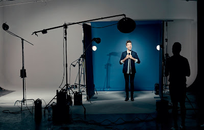
Here is a short info about colour gels, in this particular example above there is a blue backdrop already, therefore no gels were used, however similar effect may be achieved on a grey background with a blue gel attached to a background light. Colour gels are cheap and fast solution for specific look. Still I would prefer to use a blue backdrop instead a gel. Moreover even gels has something which coloured backdrops does not have. For instance, we can mix different colour gels and achieve different look and feel to an image on different parts etc.
In contemporary portrait photography nowadays we often see a beautiful background light effect in a circular shape, here is a short tutorial in Honeycomb Grids and gels in order to achieve this lighting style.
Here is one of most interesting you tube channels I have found. It consists of many informative, advanced and educational tutorials regards the science of photography (light modifiers, inverse square law, light characteristics, studio equipment, portrait composition lighting styles and ratios and many more). I have been following this channel for over 2 years now and have learned a lot.
See the link below.
Snap Factory
 |
| Dan Kennedy |
 |
| Dan Kennedy |
 |
| Dan Kennedy |
 |
| Dan Kennedy |
I love his work because they are not just portraits of people, but also blend of commercial and fine art work which makes them much more interesting. I think that a good photographer must be creative and apply some sort of art to his work in order to stand out. At the moment I am trying to find myself within this medium. I want to know where I am the best at and what I could do to make my work also valuable as an art. It does not come easy and fast, but I am ready for this journey. Apart from his portraits he is also dong a commercial work, here are some samples.
 |
| This lighting setup is very moody and creates this intimate feel to it. Again we can see a commonly used element/style which is a graduated spill effect lit background. Dan Kennedy |
 |
| Dan Kennedy |
 |
| Dan Kennedy |
 |
| Dan Kennedy |
I love to look at the fashion photographs because most of the time they are also very artistic. I am not as much interested in fashion, however I am very much interested in the photography applications behind it. It is an industry with an infinitive creative possibilities of self expression.
Here is another similar style photographer Patrick Hoelck.
He photographs people either portraits of half body shots with some commercial applications.
Patrick Hoelck Photographer & Director based in Los Angeles and New York
 |
| This example is slightly more contrasty than others, the light is harsher which brings out more facial texture. |
 |
| It is almost like a low key lighting setup, the background lighting is very interesting which helps our eyes to concentrate more on the subject photographed. |
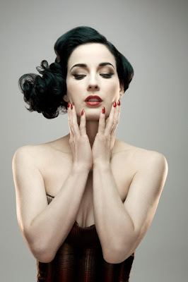 |
| The skin looks very smooth and bright. |
 |
| In this example I like the hair light which helps to separate the model from the background and the lighting cast on the jacket. |
Here are two commercial examples by Patrick Hoelck
I am really interested in portraiture and head shot photography. Recently I came across with Peter Hurley photography, which I truly call an inspiring unique and professional. He is specialising as a head shot photographer located in New York and Los Angeles. Se some of his work below. He is emphasising on a facial structure specifically the jaw line which plays enormous role in successful and flattering portraits. I have learned a lot from him in how the positioning of model can affect the overall results.
Peter Hurley
Youtube Channel
Here is a slight insight of his posing style and workflow.
His work seems to be a very simple and strong in the sense of the emotions and feelings with a quite large negative space. His approach is to make a customer feel confident and relaxed, but his true intentions is to capture a different looks from a same person by playing with them psychologically. He is keeping a constant dialogue between himself and a client which brakes the ice and makes them feel more natural, relaxed and interesting, that is the key of a successful head shot. These principles may be applied to any other type of photography. Interestingly he also claims that only part of our face can move is eyes, eyebrows and a mouth, these 3 parts are as important as a jaw line so he plays with them and finds what works best for each client.
Peter Hurley has his own signature style in terms of lighting. He is using a constant lights Kino Flos, 4 foot and 2 foot long daylight bulbs which are quite expensive but gives this flawless, evenness and flattering look. He is lighting women with an even light and them plays with lights as soon as it comes to men head shots where he starts to alter the contrast ratios to bring out the masculine character.
Lighting Setup is a quite simple. All around the subject in font of their heads ( 2 side lights, and them similar to a butterfly lighting one underneath the chin and other above the forehead facing slightly down), for a background light he uses 2x strobes just to get a white colour, but not too bright in order to prevent the light spilling on the subject.
I do use constant lights in the studio quite often and find them to be extremely good in terms of softness and beautiful look it gives. The only downside is that I have to use relatively slower shutter speeds which makes to increase ISO or shoot with less DoF (closed up aperture). Otherwise it is excellent solution. These lights can be used for any king of photography in the studio. Another benefit to cool lights is that I can see the results whilst adjusting the lights. Therefore I can work much faster and study the light more carefully.
Lighting Diagram.

Here is some of his work.
 |
| He is often calling himself as a 90% therapist and 10% Photographer. His continuous interactions with a customer makes them feel natural and confident in front of the camera, that is the key of his work in order to capture natural look which has a enormous energy, and soul. |
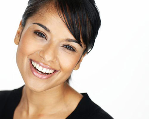 |
| He is not asking people to smile, but makes them naturally laugh if needed which then makes a difference in the final photographs. |
 |
| Squints and little smiles are very often emphasized but not overdone. Like an example above, the eyes are slightly closed and the little smile creates this natural and interesting look which reflects a personality. |
 |
| He is always trying to identify the good side of faces in order to make the best shot. He claims that some people are good from any angle and straight into the camera while others have a better side. He is always playing with a jaw line, eyes, eyebrows and the mouth - key elements! Mouth usually is not closed but has a little smile just a subtle, front shoulder is lowered in order to emphasize the jaw line, eyes are slightly squinted if necessary. He is photographing with relatively shallow DoF where the closest eye is in focus and everything else is falling out of focus. His lighting is a signature, even and very soft high key setup with a kino flos constant lights. I like the specular highlights in the eyes, almost like a square shape around the irises. |
He is completely in control during his photoshoots with both his lighting and his interaction with his clients. If you have ever had to get a particular emotion out of your subject during a portrait session you know it can be a tough task. Peter’s approach is to make his clients crack a smile by saying some of the most ridiculous comments I have ever heard during a photoshoot. Sometimes he will joke about taking yourself too seriously in front of the camera and other times he will poke fun at a funny mannerism you might accidentally express. Whatever it is he is saying, it is bound to get you smiling which he instantly captures in each frame. He has mastered the art of making people feel comfortable in front of his camera. Peter Hurley imagines exactly what the final product is going to look like and how to achieve that perfect image. Many photographers approach their photoshoots with no real game plan, or they may treat it as an artistic experiment but hope in the back of their mind they can pull something off that looks great.
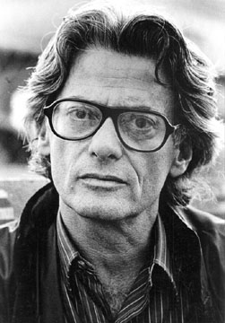 |
| Richard Avedon |
I love Richard Avedon's work. His amazing portfolio of portraits is already starting to change my own perception of portraiture. His work is fine art, the specific look and the gaze of the people captured makes his style unique and very interesting.
See his work and biography on his website Richard Avedon Foundation
His famous photographs
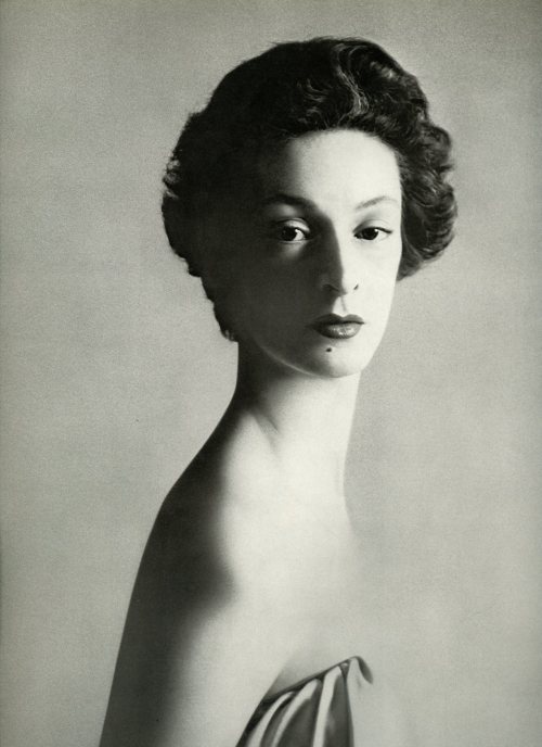 |
| Marella Agnelli, Italian socialite, 1953 |
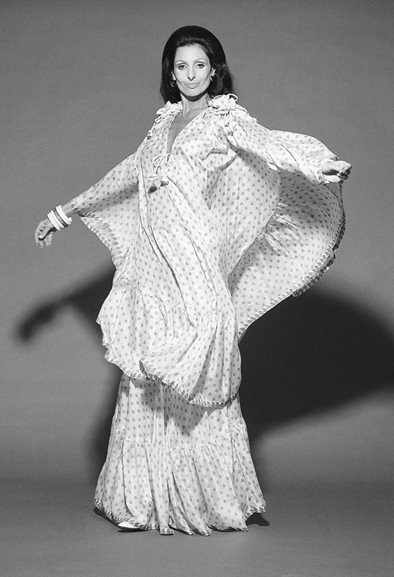 |
| Carmen Mayrink Veiga, Brazilian socialite (Vogue's 10 best dressed), 1970 |
 |
| Dovima with Elephants, 1955. In 2010, a record price of £719,000 was achieved at Christie's for a unique seven foot high print of model Dovima, posing in a Christian Dior evening dress with elephants from the Cirque d’Hiver, Paris, in 1955. This particular print, the largest of this image, was made in 1978 for Avedon’s fashion retrospective at the Metropolitan Museum of Art in New York, and was bought by Maison Christian Dior. (Wikipedia) |
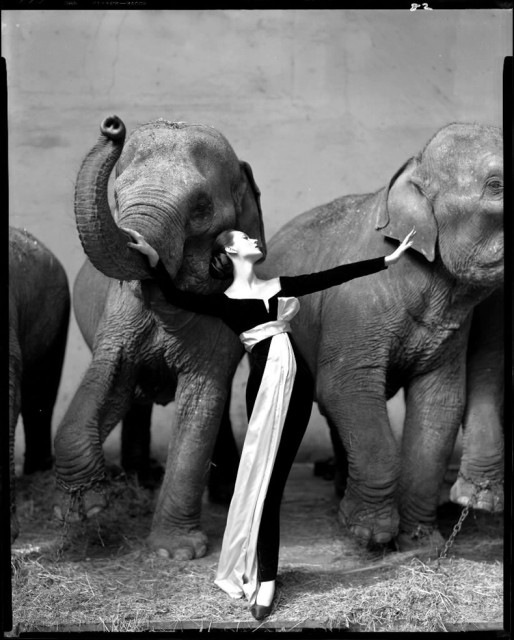 |
| Dovima with Elephants, 1955. |
 |
| Marilyn Monroe, actress, 1957 Richard Avedon describes as ‘Marilyn Monroe’ was a made up person that she created, she would come to his studio and dance for hours and then at the end when her energy was gone she just sat there with this air of sadness in her appearance and soul and she let him capture her on camera. |
 |
| Homage to Munkacsi, Carmen, coat by Cardin, Paris 1957 |
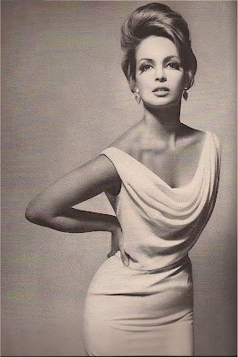
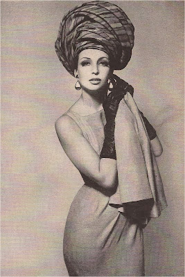
Christina Bellin, model, 1962
 |
| Dwight David Eisenhower, President of the United States, 1964 |
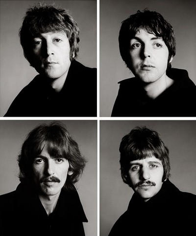 |
| The Beatles, 1967 |
 |
| Andy Warhol and Members of the Factory, New York 1969 |
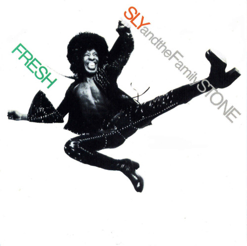 |
| Sly Stone (cover of Fresh Album), 1973 |
 |
| Asha Puthli (She Loves to Hear the Music Album back cover), 1974 |
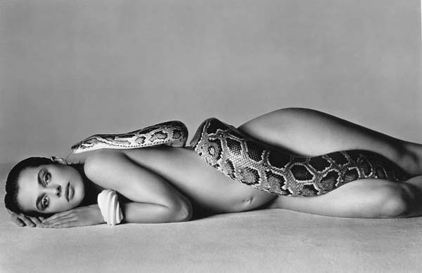 |
| Nastassja Kinski and the Serpent, 1981 Every photograph is with a beautiful gaze, models are expressing themselves though they eyes and look. I would say that that is one of most powerful elements in his photography. Most of the times people are looking straight into the camera lens, but it is not just a look, it is an expression, emotion and soul which elevates this photography on a much higher level - it becomes an Art. |
 |
| Barack Obama (2004) |
 |
| Richard Avedon. Pile of beautiful people, Versace campaign 1982. |

Richard Avedon: My portraits are more about me than they are about the people I photograph.
He photographed his father whom he had a turbulent relationship where he never felt loved and happy around him. He captured him whilst weak and frail, his father was a proud man and a strong man who later died. For Richard Avedon it was like him feeling close to him through his work as he has never done, maybe his own goodbye in a sense, over the years he photographed dads and sons together in a way this showed envy of a relationship he never had. These photos are almost like him watching him die with his camera. |
| Richard Avedon. Jacob Israel Avedon |
 |
| Richard Avedon. Jacob Israel Avedon |
 |
| Richard Avedon. Jacob Israel Avedon December 19, 1972. |
Here is an excellent documentary film abut Richard Avedon and his life. He is also talking about his distant relationship between him and his father. He did photograph his father just before his death.
RICHARD AVEDON "In The American West''
Focusing on the rural West, Avedon visited ranches and rodeos, but he also went to truck stops, oil fields, and slaughterhouses. Rather than playing to the western myths of grandeur and space, he sought out people whose appearance and life circumstances were the antithesis of mythical images of the ruggedly handsome cowboy, dashing outdoor adventurer, or beautiful pioneer wife. The subjects he chose for the portraits were ordinary people, coping daily with personal cycles of boom and bust.
Instead of glamorizing these figures, he brought their various human frailties to the forefront. All his subjects are pictured against a seamless white backdrop that removes any reference to place, and many of the portraits are dramatically oversized, shocking in their stark detail. Visitors to the exhibition come face-to-face with images that shattered stereotypes of a glorified region. (http://museum.stanford.edu/news_room/Avedon.html)
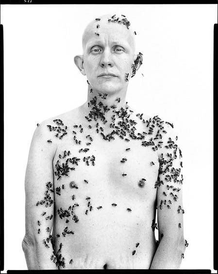 |
| Ronald Fischer, beekeeper, 1981 |
 |
His Signature is the white background and the black border. He depicts the essence of the western lifestyle and farming. He isolates the environment making us to read the image only from the subject photographed. There is nothing else than just a white backdrop and the subject photographed and yet, it is very strong approach which makes us to closely study the people photographed which was Avedons intentions. Although he claimed that he is in the charge of everything and that photography is more about himself rather than a subject photographed.
His lighting setups are not very complex, but the photographs are expressing complexity and human nature. Even if the photograph is a straight forward portrait it is complex and interesting at the same time, it is the look through the eyes and the expression which is captured in the photograph. No matter how good photographer is with his technical skills, there are no doubts that the personality and communication skills are absolutely vital and plays enormous role. His portfolio consists of many different frameworks and categories, like his 'American West', 'Democracy' , 'Family', 'Art', 'Music', 'Theater', 'Literature', 'Politics', 'Film', 'Dance' and his 'Father - Jacob Israel Avedon'. Each of these portfolios consists of unified style Photographs, based on some theme which runs through. They work as a series of projects in different categories. I would like to work in a similar way as well. These portfolios are suggesting things where Richard Avedon was interested in.
I could see myself in doing a similar type of projects myself in the future, but with my own style, subjects, themes and surrounding issues which are relevant to me. It could be done either on a location or in the studio environment. It all would depend form the subject and the idea.
Most of his personal work was black and white based, although there are some color photographs.
Here is link to his Website (http://www.richardavedon.com/index.php#mi=1&pt=0&pi=1&s=0&p=-1&a=-1&at=-1)
I have noticed in his work a tendency for the subject either stare in the lens or look slightly away in the distance which creates very interesting gaze in the face, the whole mood in the photograph changes. For instance Marylin Monroe is looking away from the camera, it feels so mystery same look is present in Dwight David Eisenhower, President of the United States, 1964 photograph but slightly less noticeable. By contrast there are many photographs were the subject is looking directly in the lens for example his "In American West" and his other portfolios with politicians like Barack Obama, etc.
He claimed that he is an artist/commercial photographer, in the way he was quite aggressive in his appearing as an artist. He did not care about the critics from others, he was strong emotionally and knew what he wants to achieve in his work. As he clams a lot of young photographers that time could not resist the strict analysis of the work produced, often even without compliments, despite that Richard Avedon knew how to live with that, it made him stronger and better. His work is a fine art/documentary, Like his work "In The American West" the farmers and other people were represented in their natural true form. No manipulations were done, he just isolated them form the background by using a large white backdrop. It is all about the Western culture and lifestyle.
In this following example I am exploring the possibilities of a commercial portraiture for various media forms (magazines, newspapers or web) I do prefer the magazines due to higher quality representation and fashion trends.
Naomi
Kaltman is well
known for her intuitively sexy and luminous style of photography. Born and
raised in New York, she studied dance early on and dabbled with the idea of
architecture, but ultimately went on to study at The New York University Film
School, chosing photography as her primary medium. After graduating Naomi moved
to Paris, France. During this time living abroad she established herself as a
favorite for celebrity sittings with iconic images done for Arena, Italian
Glamour, British GQ, and Manner Vogue, among others. After 4 years based in
Paris, Naomi returned to live in the States. She shoots regularly between New
York and Los Angeles.
In
hardcover Naomi's images can be seen in the photographic anthologies
"Crazy Sexy Cool" from the creators of Rolling Stone, and "Four
Inches" - a collaboration between Jimmy Choo and Cartier, published by
Scriptum Editions.
 |
| Naomi Kaltman |
 |
| Naomi Kaltman |
 |
| Naomi Kaltman |
 |
| Naomi Kaltman |
 |
| Naomi Kaltman |
 |
| Naomi Kaltman |
She extensively uses
a butterfly lighting style with a fill light below the chin. Most of the time
her photographs are high key whit very flattering look. I really like the
composition, the closeup. I love the landscape format rather than a portrait,
this way it seems to be a little bit interesting, different from a classic head
and shoulders portrait. Every time I see magazines or journals I do pay attention to the imagery, especially in how they were shot, what kind of lighting was used and also the retouching style. They seem very interesting to me, and I like to analyze/deconstruct them. I guess I am very interested in the technical side of photogpraphy as well as ideas behind photographs.
Here is my work in the studio environment where I am trying to explore the basics of studio lighting setups.
In the video below Mark Wallace is explaining and demonstrating the 6 fundamental lighting setups. I have learned a lot from his tutorials.
Here are few photographs by Using a Butterfly / Beauty lighting which I photographed. It is quite flexible lighting and often used in fashion portraiture work. It is very flattering and even. Butterfly lighting, also known as Paramount lighting, became a staple pattern for the Hollywood photographers of the 1930s. This lighting is characterized by the butterfly-shaped shadow that it casts below the nose. The butterfly pattern can be quite useful for a variety of faces, but is at its best on lean subjects with high and pronounced cheekbones. It is produced by placing the light source above the face (typically 25-70 degrees) and in line with the direction in which the face is pointing.
Here is a lighting diagram for this setup.
In the video below Mark Wallace is explaining and demonstrating the 6 fundamental lighting setups. I have learned a lot from his tutorials.
Here are few photographs by Using a Butterfly / Beauty lighting which I photographed. It is quite flexible lighting and often used in fashion portraiture work. It is very flattering and even. Butterfly lighting, also known as Paramount lighting, became a staple pattern for the Hollywood photographers of the 1930s. This lighting is characterized by the butterfly-shaped shadow that it casts below the nose. The butterfly pattern can be quite useful for a variety of faces, but is at its best on lean subjects with high and pronounced cheekbones. It is produced by placing the light source above the face (typically 25-70 degrees) and in line with the direction in which the face is pointing.
 |
| Editing is done entirely in the Lightroom. It is converted to black and white with a subtle toning and increased contrast. |
Here is a lighting diagram for this setup.
One of my favorite lighting setups is Rembrandt Lighting. It is mostly used to photograph men, which emphasizes masculine facial texture and features. It looks rally good on a low key lighting setup. Rembrandt lighting is named after the famous Dutch painter of that name. The lighting is similar to loop lighting, but with the light source moved higher and further left or right of the face. It creates a strong pattern characterized by a small triangle of light that appears under the eye on the shadow side of the face, along with a nose shadow that nearly extends to the corner of the mouth. This is not an all-purpose lighting and is probably best reserved for character studies and moody fashion work.
Here are few examples from my own work.
 |
| If I use the black backdrop I tend to photograph in Black and White form, somehow it makes all look better. It accentuates the shape and contrast. |
Few examples below are photographed by using a Rembrandt lighting setup on a different backgrounds. Personally I think that this set up looks much better on a darker backgrounds in monochromatic form, it creates more mood and characteristic. Probably at this point it is one of my favorite setups with just one light source. I could introduce a spill light on a background to separate the subject from it, also the hair light and possibly shoulder/jaw lighting.
Short and Broad Lighting
Lighting is said to be short when the light source illuminates the side of the head not visible to the camera. The short-lighting position is probably the most commonly used position. It works well with a variety of faces and is often mentioned as the choice for narrowing the face.
Here are few examples of a short lighting which I have applied in my studio practice.
 |
| It is also an silhouette. There is no colour at all therefore I always convert my studio silhouettes in Black and White, it becomes a game with a shape and form. |
Lighting Diagram
In these examples light is illuminating that side of a face which is away from the camera, that why it is called a short lighting. It narrows the face and also is very contrasty. I did not use any fill light, but if I wanted to reduce the contrast I could introduce a second light (fill light) on the broad side of the face.
Broad Lighting.
Lighting is said to be broad when the light source illuminates the side of the head visible to the camera.The broad-lighting position is very useful, but not so popular as the short position. It is often said that broad lighting makes a face look fuller, as it illuminates both the side and front of the face. I'm not sure this is nearly as true as it sounds. With appropriate positioning of the face, broad lighting can be used to either broaden or narrow the apparent width of the face. Broad lighting is also useful for eliminating eyeglass glare, as the direct reflections from the light source are directed away from the camera.
Lighting diagram
 |
| Again, the key light source has to be set according to the broad side of a face in relation to the camera. It is very contrasty lighting. |
Loope and Closed Loope Lighting.
The classic loop lighting is done with a light from the side and above the subject pointed down. Use your modeling light on the Bee to see the effect. The shadow is to the side of the nose but not touching the lip. It's not really an effect that has to be done with two lights but if you do use a fill it will just lighten the loop and give a better snd softer effect. Better depth too. One thing to remember is to watch for the illumination on the eyes. If the loop from the nose is in the correct position but the upper part of the eyes are in shadow you must lower the main light until the eyes are fully illuminated. The eyes are the highest priority and it's worth sacrificing the loop to light the eyes.
Often closed loope lighting looks similar to a Rembrandt lighting, but it is not exactly the same.
Direction of a light source determines its characteristics along with a light shaping tools and diffusers. I am trying to understand these principles of a practical and technical side of studio photography. More I understand in how to light a subject in various ways and styles - better I will become in my own artistic photography. I am visualizing the outcome of a photograph, but sometimes it is hard to achieve the look I am going for, therefore I am studying the fundamentals of the light and how to shape it. These skills will let me be more successful with my career and also my other projects.
As a portrait photographer I would like to learn retouching on a professional level.
I did purchase book by Scot Kelby 'Professional Portrait Retouching Techniques For Photographers using Photoshop'. It includes retouching techniques for everything I need to know, starting from hair retouching, skin, eyes, till serious manipulations with facial structure etc. I am very pleased with the book. Here is an example of my retouching learned from this book. It took me about an hour till I reached results I wanted. The goal was to keep it as natural as possible.
It is as important to understand the natural light as to know the lighting in the studio, for me natural light seems to be much more pleasing, it is also much harder to control. Here is a quick example of a portrait shot indoors by using a natural light coming from the window.
In This example I was exploring the possibilities of rim lighting combined with a butterfly Lighting.
 |
| Here is an example of left kicker light on. It is with a standard reflector and a flag in front of it. I really like the cheek lighting for men, it emphasizes the jaw line and the shape of the face. |
Here is the initial idea for the lighting above. However I could not achieve this style at this point, but It is in my opinion absolutely beautiful and creative way of using light. It can be easily achieved in outdoors when sun is just above the horizon (sunset time) or alternatively in the studio which requires more work. Here are few examples from Mark Wallace work.
 |
| Photograph by Mark Wallace. The lens flare is giving a beautiful effect which I think makes this photogprah. |
 |
| Photograph by Mark Wallace |
Low Light - Low Key work. I was going for a very dark and scary evil look which would show only an outline of a subject. All shot with a single snoot so that light is very directional and lighting only that part which I wanted to. I would use this light as a part of a larger setups - a kicker/hair, separation or rim lighting.
 |
| Shot with a snoot coming from the behind on the right side. Metered from the highlights. |
This lighting is very moody, extreme contrast and works excellent as a contouring lighting. Similar effect to a silhouette. It becomes an experimentation process with a shape, form. In this scenario my friend tried to express himself in a very scary way, which reminds me of a devilish look. As in such low light setup colour is out of question, therefore I converted them in black and white, I knew and saw this setup as a black and white only. Sometimes I do tend to set my camera right away in monochrome mode, so that I could see the output instantly and work from there.
Apart from the experiments within Studio Environment particularly in portraiture I have also worked in product photography.
I have just finished a project for the Welsh Slate company. I was invited for the product shoot by the Blue Stag Studios in Cardiff. There are a very big range of products to be photographed, they are all sort of slates and consumer products such blankets for the sofas, soup holders and the catering tools mainly serving plates, coasters and more. I like to photograph a still life. It is all about the little things nuances which makes the product pop! In this case I will be using food in order to emphasize the quality and beautiful/design nature of the product in the rustic comfy style. In order to capture the best quality photographs I will be using mini studio strobes with a softbox and similar diffusers to make very soft even lit lighting.
Here are some of the examples by other photographers which I find to be very helpful in my own workflow and preparation.
 |
| Products I photographed were similar, however the setup was different. |

 |
| Food does make a difference, however key element is the slate itself. Food is an element which strengthens the product. |

| The setup I used was similar to photographs below. The wooden floor texture is the key element in my product shoot. Slates are very qualitative, therefore the environment where they are shot must strengthen the product. |
| I do prefer the angle from aside rather than from above, in that way I can bring out the dimensions of the product. |
Here is a little tutorial video in food/product photography by Adorama TV "How'd They Do That" featuring Rick Gayle.
Here are some contact sheets of the product shoot to give an insights of how it looked like during the shoot. We did photograph in environment for the website design, they were meant to be very warm, quality, little bit antique to make them appear as a must have product for any home. The location for the shoot was a coffee shop in the Queens Arcade which has a fantastic interior design for this kind of shoot. We had only an hour and many products therefore our workflow was very fast and productive. Regards the lighting I did not use any flash strobes, but a sturdy tripod was a must tool. I had with me on the location mini studio strobes and the light tent, however the light was very soft and all I needed was a little bit fill light or a black foam board in order to shape the light or take it away. Second and most important shooting location was an empty store, if had a floor to ceiling large window which worked as a big softbox, therefore there was absolutely no need for a studio lighting. It also made our workflow much faster and consistent. All the preparation for the shoot was done two weeks prior. I was briefed twice about the project and the final product. We had a discussion about the possible ways to achieve the best results - technical and visual side of photo shoot. Photo session took us the whole day, we worked as a team constantly referencing on the achieved results. We looked at the examples and analyzed our progress. The key of success was the beautiful light and the texture variety which worked very well with the products.
In order
to make this session even better I could have a macro lens or telephoto lens,
so I could get closer to the product, despite that little inconvenience I had
all tools necessary to achieve my desired goals.
All the contact sheets are in chronological order.
 |
| Fig.1 |
 |
| Fig.2 |
 |
| Fig.3 |
 |
| Fig.4 |
 |
| Fig.5 |
 |
| Fig.6 |
From this project I have gained more confidence, time management skills and more experience in adapting to the situations, quick and effective problem solving. There are no jobs which always will go according to a plan, therefore it is very important to be flexible, capable to make changes, to adapt to the situation and be effective in problem solving. Luckily in this project we did not have any major problem. As a problem I could mention lack of time in the coffee shops, therefore shooting process was a little bit too fast.
Apart from manipulated portraiture work, I love Richard Avedon's 'American West' work, it is an fine art documentary photography capturing a series of a working people in West America.It would be an amazing opportunity and challenge to photograph something similar in Wales, like sheep farmers in Valleys or any other profession people, however it is quite complex way of photographing due to technical requirements and process itself where I would need a lot of help. There are always ways around it, I could use studio instead the on location environment, but It would limit my capability to capture the real person in the most real way. As well as people might not want to make a journey to the studio. The idea itself is very good and interesting, but the execution of it is far too complex to the time frame I have.
One Of my favorite artists is Gregory Crewdson, his style is cinematic looking photographs which are staged and planned on a very complex and large scale. It includes models/actors film crew, film lighting setups along with other types of lighting, preplanned scenarios. Everything is planned a long time prior, these steps makes his final prints extremely complex and absolutely stunning.
Gregory Crewdson's photographs usually take place in small town America, but are dramatic and cinematic. They feature often disturbing, surreal events. The photographs are shot using a large crew, and are elaborately staged and lit. He has cited the films Vertigo, The Night of the Hunter, Close Encounters of the Third Kind, Blue Velvet, and Safe as having influenced his style, as well as the painter Edward Hopper and photographer Diane Arbus.
There are artist around who are doing a similar work but on the smaller scale such as Lottie Davies, it still has this staged cinematic feel to it in a surreal abstract way. That is what grabs my attention.
I would love to do something similar in my own photographic practice. But again in order to capture similar scenes it would take a lot of time and preparation and variety of locations, not to mention lighting. I am keeping my options open, these are just ideas in which areas I would like to express myself. Another example in this kind of staged surreal photographic art I could mention work of David Lachapelle, his work is often very contradictory with religious symbolism.
Series of "Memories and Nightmares'' by Lottie Davies
http://www.lottiedavies.com/#/Art/Memories%20and%20Nightmares/7/
David Lachapelle
Series of 'Rape of Africa'
2009Rebirth of Venus
2009
David
Lachapelle is an artist and photographer known for combining a hyper-realistic
aesthetic with social messages, he returned to Fine Art in 2006 . His work is
very interesting and yet contradictory. Often saturated with religious
details.
Return to Fine Art
In 2006,
LaChapelle decided to minimize his participation in commercial photography, and
return to his roots by focusing on fine art photography. Since then, he has
been the subject of exhibitions in both commercial galleries and leading public
institutions around the world. He has had record breaking solo museum
exhibitions at the Barbican Museum, London (2002), Palazzo Reale, Milan (2007),
Museo del Antiguo Colegio de San Ildefonso, Mexico City (2009), the Musee de La
Monnaie, Paris (2009), the Museum of Contemporary Art in Taipei, Taiwan and the
Tel Aviv Museum of Art, Israel. In 2011, he has had a major exhibition of new
work at The Lever House, New York and retrospectives at the Museo Arte
Contemporáneo de Puerto Rico (through March 2012), the Hangaram Design Museum
in Seoul (through February 2012) and Galerie Rudolfinum, Prague (through
February 2012).
I think that is very important to work around a strong idea, issue in order to create photographs with a meaning and message. His work contains a story or issue which he tries to express through this medium. And that is why we can call his work an Art. It is very complex constructed work, technically in post-production and while shooting in the studio. I would love to try to create something myself where I would be able to express myself and the issue which is important to me. It would be a way of communicating with other people and letting them know of what I think or how I see things.
http://www.davidlachapelle.com/
Below are few ideas which I want to learn and explore in the Photoshop. This could be a possible direction of my major project.
Water Reflection Tutorials
http://www.photoshopessentials.com/photo-effects/water-reflection/
Scary manipulated portraits
Painting Effect
http://www.hongkiat.com/blog/painting-effect-photoshop-tutorial/
Video on You Tube
Vampire Effect Edit
Portrait of a Text
Fractured Photogprah
Here is my edit in a similar way. I am just exploring possible ideas for the major project. Possibly I will edit them in a similar ways, double exposure approach with layers. The imagery selected would have a specific meaning, like here trees - symbolizes the natural habitat, nature, sustainability. At the moment it is just a test.
 |
The basic idea is to give my portraits more artistic meaning. This meaning would be themed thorough my imagery. Possibly it will be an issue around us, political, ethical, social or any other kind. At the moment I have a plan in terms or technical side, however the idea behind it is unclear at this point.
As my main influence in this particular direction of photography is Jerry Uelsmann and His wife in digital practice Maggie, even though Jerry Uelsmann is still working in a traditional black and white photography his imagery in outstanding art with an extreme quality ideas and technique.
 |
| Voyager, 2008; Untitled, 1982 |
 |
| 1999, Jerry Uelsmann |
 |
| 1965, Jerry Uelsmann |
His work is very surrealistic. And it is my favorite art movement - surrealism. Somehow I have always been fascinated by it. Besides the straight photography, I do love the possibilities behind our conscious or unconscious imagination. Surrealism lest us to explore our dreams and imagination, and by manipulating the real we can create an amazing piece of art. I would love to learn some of photo manipulation techniques which would open the doors for this art. Therefore I might to explore this style in my major project.
 |
| 2008, Jerry Uelsmann |
Surrealism as a base for my major project workflow.
I would like to use my knowledge in the studio and apply some serious manipulations in the photoshop to achieve surreal looking portraits. They would be a series of a different type of people and different effects applied, but as a whole series it would reflect the surrealism and fantasy combined with a reality ( I am planning to mirror the effect so that only a half of the photograph would be manipulated and other half would be the original). At the moment I am not quite sure whether it would be as a mirror effect below the chin or simply splitting the face into two parts.
Here are few examples on how I would like to use the mirror effect or similar approach where I would represent both manipulated and real side of a person.
 |
| Good and Evil |
 |
| Flash freezes any motion so I asked my model to shake his hair in order to create more dynamism and feel. |
 |
| This is my favorite silhouette. I love the lit outline of the face, it creates much stronger feel an impact. |
Very Recent influence from Joey Lawrence work. He is a commercial based photographer and also does his own personal work - documenting ancient tribes around the world. In his personal on location work he usually uses on location lighting, often a large sized octabank. His personal work is outstanding, it represents various tribes and people, they are one of the most beautiful portraits I have ever seen to this day. I am inspired and amazed by the captured facial expressions and personalities, the human nature in its most purest forms where no Western Civilization seems to be at present. Every time I see his work, it makes me want to pick up the camera and go outside. It is the work I would love to do as well. I love to travel and explore different cultures, this is something I want to apply in my own career and personal work.
This is definitely the direction I would like to turn my own photography. The lighting is a crucial part of his style. Large octabank is a very versatile and soft light source, perfect for groups.
I would like to learn how to use a lighting on location. Perhaps Next term I will try some of these techniques.At the moment I am thinking very broad because I am trying to find a niche I will work in and also develop my own style.
I also found the KelbyTraining.com which is a must site for a learning photographers. I have learnt a lot from his easy understanding and yet quite advanced tutorials in Photoshop, lighting, and equipment.
Here is my Instagramprofile, click link. I do upload some of my own stuff over there, it includes portraits and my other shots. http://instagram.com/eddzande
Here Are few shots from my Instagram profile.
They are photographed with my DSLR and edited in Lightroom or Photoshop and finished in Instagram where I introduce some effects like boarders, cross processing. It is basically a way of sharing my work with other people. Also I love the inbuilt presets. I want to create my own action in Photoshop with a similar kick, but be more personal.
 | |||||
| This is one of my street portraits form Documentary Module brief 'Street Portraiture' |
More or less my best work is created in a Studio environment. It is my passion and It makes me feel much better as a photographer. I love portraiture, people with interesting features and If I succeed It is all I need, a single beautiful portrait.
I really enjoy looking at fine art photographs. Here Is a recent discovery of an award winning photographer Hamilton Herr. His fine Art work is something similar I was thinking for my major project. It includes textured skin, mirror effect and much more.
Today 11/12/12 I came across to a fine art photographer
Raphael Guarino. His work is an outstanding and beautiful set of portraits in fine art.
They are very simple in terms of props and lighting, however the impact they leave on the viewer is enormous. His style is usually on a black background with a single light source. He often uses interesting clothing, smoke effect or even dust. These elements are incorporated within his work, and makes his style very interesting and absolutely artistic. At some point I do get tired and question myself in what I want in photography. And the answer to this question would be something like this. i want to be able to create portraits which would be something much more than just a portraits. I want to create a meaningful art within my work and at the same time make my living through it. It is a very long way, but I know I can achieve it by hard work and experimentation. |
| His work is very interesting, moody and mystical. Most of the times it is in Low key setting, which creates more drama and mood. |
 |
His work reminds me of Andrzej Dragan, the retouching in some of his work seems to be quite similar. |
Andrzej Dragan
His style is very interesting and has became very well known around the world. It is almost like an HDR portraiture, but it is not as harsh, very moody and low key. It depicts the essence of characters, personalities. Mainly I am very much interested in his post processing workflow and his style.It seems to be a bit unreal, which at some point makes it surreal. They are not straight forward portraits, but Art around the idea of fantasy and unreal.
 |
| The colours are very creative,vivid and unreal as we see them around us. It makes these photographs be artistic and surreal. |
I might explore ideas around phobias by other people, my own, nightmares, or some sort of trauma which has made an impact on who I am. Surrealism is closely related to our subconsciousness - dreams, nightmares, imagination. It is infinite world of possibilities. I will try to reflect a specific theme in my major project. I like the idea of series of silhouettes where I would incorporate another image within it which then would reflect this phobia. Image within image, It will be manipulated project in the Photoshop. I have an idea of a general theme and many different approaches, techniques which I might use, however i want to create a series of work which would work with each other and fit within a theme. For next few weeks I will write down the most important themes which I think will be the best for the project and then I will present the idea and reflect it in my final project.
Major Project
It took me a while to put my thoughts in coherent way and to understand what I really want to carry out for this project. Finally I have decided to keep photographing in the studio environment "portraits of unusual". I have always had this interest in military props, such clothing or masks, therefore I have decided to create series of portraits based on military/surreal/dramatic ideas. Some of my work will not make any sense, but that is one of my ideas. I am going for a dramatic look. Gas masks symbolises pollution and danger which I am concerned about, military props would suggest power and control over us. The key idea thorough my work is about "us" "people" who does things go worst than they are. I really enjoy studio work, specifically beauty shots and close up portraits. However for this project I will try to explore new ways of lighting my subject, work with a specific theme and idea thorough my project and most importantly tell the story of what I have imagined in my thoughts. Not all of my final work will be purely surreal, There is gonna be some diversity so that It would suggest something real as well as fantasy. Earlier I thought of heavy manipulations in Photoshop, however at this stage I do not think that my work will be manipulated too much. I rather achieve the look I am going for in the studio environment whilst photographing.
I have bought 5 different gas masks and hats for my props. I guess that preparation is as important as processing and post processing stages in any project, therefore It took me a while to get things I needed. I am inspired mainly from Andrzej Dragan, Gregory Crewdson, Raphael Guarino work! I am trying to take a little bit from everyone and putting in my own work. obviously there countless other inspirations around and many photographers which work I do consider to be very important and interesting.
Here are my first shots in the studio.
I started with a large soft box, however this light modifier was creating too soft light and I wanted this harsh look, therefore I used a beauty dish far from subject to even dramatise this look.
The whole project is based on idea of Apocalyptic/post Apocalyptic life, caused by an military conflict, warfare, nuclear catastrophe. I am trying to create a series of surreal and fictional photographs with a strong sense of Catastrophe and the dark side of humanity.
Apocalyptic
fiction is a sub-genre
of science
fiction that is concerned with the end of human civilization
due to a potentially existential
catastrophe such as nuclear
warfare, pandemic, extraterrestrial
attack, impact event, cybernetic
revolt, technological singularity,
dysgenics,
supernatural phenomena, divine
judgment, runaway climate change, resource
depletion, ecological collapse, or some
other general disaster.
Post-apocalyptic fiction is set in a world or civilization after such a
disaster. The time frame may be immediately after the catastrophe, focusing on
the travails or psychology of survivors, or considerably later, often including
the theme that the existence of pre-catastrophe civilization has been forgotten
(or mythologized). Post-apocalyptic stories often take place in an agrarian,
non-technological future world, or a world where only scattered elements of
technology remain. There is a considerable degree of blurring between this form
of science fiction and dystopian
fiction.
The genre gained popularity after World War
II, when the possibility of global annihilation
by nuclear
weapons entered the public consciousness. However,
recognizable apocalyptic novels have existed since the first quarter of the
19th century, when Mary
Shelley's The Last Man was
published.
Ancient predecessors
Numerous societies, including the Babylonian
and Judaic, have produced apocalyptic literature and mythology,
which dealt with the end of the world and of human society. The Epic of
Gilgamesh, written ca. 2000--1500 BC, details a myth
where the angry gods send floods to punish humanity, but the ancient hero Utnapishtim
and his family are saved through the intervention of the god Ea. The scriptural
story of Noah
and his Ark describes the end of a corrupt civilization and its replacement
with a remade world. The first centuries AD saw the creation of various
apocalyptic works; the best known is the Book of
Revelation (from which the word apocalypse
originated, meaning "revelation of secrets"), which is filled with
prophecies of destruction.
There are numerous
reasons/causes or to say ways of Apocalyptic/Post Apocalyptic life:
War
Failure of modern technology
Pandemic
Cosy catastrophe
Here are my first shots in the studio.
 |
| Here is a quick lighting diagram: Shot at around f8 125/s, snoot is set around at f8- f11 |
I started with a large soft box, however this light modifier was creating too soft light and I wanted this harsh look, therefore I used a beauty dish far from subject to even dramatise this look.
 |
| Here is direct comparison between the effect of that gel. It looks much different, but still blends nicely with the subject. |
I have been inspired from various surreal artists, and here is a quick explanation of what surrealism is!
Surrealism is a cultural movement that began in the early 1920s, and is best known for its visual artworks and writings.
Surrealist works feature the element of surprise, unexpected juxtapositions and non sequitur; however, many Surrealist artists and writers regard their work as an expression of the philosophical movement first and foremost, with the works being an artefact. Leader André Breton was explicit in his assertion that Surrealism was above all a revolutionary movement.
Surrealism developed out of the Dada activities during World War I and the most important center of the movement was Paris. From the 1920s onward, the movement spread around the globe, eventually affecting the visual arts, literature, film, and music of many countries and languages, as well as political thought and practice, philosophy, and social theory.
Dictionary: Surrealism, n. Pure psychic automatism, by which one proposes to express, either verbally, in writing, or by any other manner, the real functioning of thought. Dictation of thought in the absence of all control exercised by reason, outside of all aesthetic and moral preoccupation.
Encyclopedia: Surrealism. Philosophy. Surrealism is based on the belief in the superior reality of certain forms of previously neglected associations, in the omnipotence of dream, in the disinterested play of thought. It tends to ruin once and for all other psychic mechanisms and to substitute itself for them in solving all the principal problems of life.
Encyclopedia: Surrealism. Philosophy. Surrealism is based on the belief in the superior reality of certain forms of previously neglected associations, in the omnipotence of dream, in the disinterested play of thought. It tends to ruin once and for all other psychic mechanisms and to substitute itself for them in solving all the principal problems of life.
Recently I came across this amazing artist who creates very interesting and unique portraits - Oleg Dou.
Born in 1983 in Moscow.
As his mother was a painter and his father was a dress designer, in his childhood Oleg Dou used to gather with the artists and to spend a lot of time reading is father’s fashion magazines. At the age of 13, his parents offered him his first computer set up with an old version of Photoshop with which he already began to transform his schoolfriends or teachers faces. After studying design, he worked as a web designer. In 2005, he buys his first professional camera.
Discovered in 2006 by Liza Fetissova, Oleg Dou is represented today by galleries in France, Belgium, Netherlands, Spain, Russia and United States. His worked has been published in a lot of international reviews. He is one of the most promising artist of his generation. In 2011, the Artprice company, leader of the information on art value, has graded Oleg Dou in the top 3 of the under 30 years old photographers the best saled in public auctions. One of his images will make the cover of an extensive " Frozen Dream, contemporary art from Russia" book, from TransGlobe Publishing and Thames & Hudson.
Oleg Dou lives and works in Moscow.
The portrait, the icon. The fascination that artists have always had for the faces of their peers, the social and the affective function of portrait : aren’t they typically occidental ? After all, we do not find this portraits in the history of other parts of the world. For a long time in Europe - as coins can testify it - reproducing the face or the profile of an important person is a political or religious powerful act. Looking into the features for life mystery, exploring soul torments or even releasing the genius of creation are pursuits that motivated painters for centuries.
Oleg Dou, young Russian photographer, fits in the line of this movement. His work is all the more reason interesting for it belongs to a period in which we could imagine that portrait has no sense anymore: sophisticated reproduction techniques to invent and erase faces, obscure or obviously repressive totalitarian ideologies, idolizing tyrants faces or deifying model citizen, surgical consumerism in favour of modern standards of beauty.
Dou makes the synthesis of these mutations to raise the question of identity. His portraits are the receptacle of every evils, fantasies and tendencies of our century and drive a far too fragile message of humanity, concentrated in the eyes or the lips of his models. Alteration, scarification, radiation, and even collage and cross-ruling… the portrait becomes an abstract canvas, a place of creative expression for the artist, thus a repository of his time. The resulting mise-en-abîme (or the hybridisation) galvanizes affects which are deeply buried in our collective unconscious and evokes the desperation of the individual against the ideological and social state-owned apparel, the fear of the child face to a cruel modernity, the resignation of Man at the hands of a destiny which drifted away from him.
Dou’s work finds its roots in our occidental culture as it stigmatises the tradition of portrait with a contemporary spirit, the one of our new human condition.
As I am very interested in studio photography there are many concepts I need to learn and understand. One of most important skills is communication between me and model, then it goes to technical stuff, such lighting modifiers, lights, lighting ratios and much more. Here is some quick insight of lighting ratios.
Common Lighting Ratios
| ||
| Ratio | Stops Difference | Description |
| 1:1 | No Difference | Flat lighting |
| 2:1 | 1 Stop | General color photography |
| 3:1 | 1 1/2 Stops | General black & white photography |
| 4:1 | 2 Stops | Dramatic lighting, low key |
| 8:1 | 4 Stops | Very dramatic, low key |
Here is a quick insight of Lighting Ratios by Mark Wallace (snapfactory)
Today I found this interesting technique called "THE BRENIZER METHOD"
It is a very interesting way of photographing people, similar panorama technique, but essentially different. Here are few photographs created by this method.
Here is some of his work which has caught my attention.
Series of "HAVAIANAS"
Here in my work in progress:
For a long time now I have been a firm believer in Nature. Mother nature has been my savior whenever I’ve been lost, confused or doubtful. Just stepping outside into the garden or going for a hike in the woods, where I can immerse myself in the peace and quiet, clears my mental pollution.
This photograph is a literal composition of the concept that Nature can often catch us when we feel as though we are falling. The fantasy of being carried away by a flock of birds into the clouds, is one I feel we all have shared at one point. So I hope that you feel inspired to take that walk or book that camping trip and let Mother Nature take you under her wing.
Below are some fine portraits captured by using a baby powder as a beautiful visual effect.
A creative way to use baby powder as a smoke replacement for your photoshoots. Now we’re taking that to a different level. Have you ever tried to shoot powder as just, you know, plain powder? By throwing powder (flour,baby powder or color pigments) on your models, you can get some very creative results. Check out these great examples found on Flickr and get inspired.
Ryan Brenizer created this method and here are his thoughts and instructions with examples. See his website Ryan Brenizer
SO WHAT IS THE BRENIZER METHOD?
Essentially it is the same concept used by landscape photographers known as panorama stitching except instead of stitching a bunch of horizontal shots together to form a wide image, the images are horizontally and vertically stitched to create a wide and tall image not unlike a square. And because you are stitching together many files, you are creating a very high resolution image that can hold up to very large print sizes without loss in quality. By shooting at a very shallow depth-of-field (DOF) and then stitching the shots together, you’re exaggerating the shallow DOF.
 |
| Camera: Nikon D600 Lens: Lens: 47-image “Brenizer method” panorama with the Nikon 85mm f/1.4G (equivalent of 28mm f/0.45 according to Brett’s calculator) |
 |
| One more of Kelsie before things start to get really geeky around here … I’ve got some exciting stuff coming in, and that means I finally need to get around to reviewing my new secret weapon first. — Camera: Nikon D3s Lens: 7-image “Brenizer method” panorama with the Nikon 85mm f/1.4G (equivalent of 50mm f/0.8 according to Brett’s calculator) |
Here are some examples by other photographers.
 |
| This is quite nice example with explanation on how to achieve results like this. |
 |
| This diagram is showing how to shoot these overlapping photographs. |
Here is Adorama Photography TV presents "How'd They Do That?" featuring wedding photographer and visual storyteller, Ryan Brenizer. In this episode of "How'd They Do That" Mark talks to Ryan Brenizer in Central Park about Ryan's photography style and his unique "Brenizer method". Enjoy learning about Scott's technique and how he creates his special "Brenizer method" images.
 |
|
28-image “Brenizer method” panorama with the Sigma 85mm f/1.4 (equivalent of 27m f/0.44)
|
 |
|
Ariana and Eric, alone in Manhattan. 29-image Brenizer method.
|
 |
|
From my first foray with it. 62 images with 70-200mm f/2.8
|
Here is another video with Ryan Brenizer
Recently I came across to Ian Ruhter photography. He created worlds largest truck camera and works with wet plates. His work is outstanding and aesthetically excellent. Mainly he focuses on portraiture photography. Here are some examples of his work.
Here are few photographs from series "American Dream"
These portraits are extremely detailed and contrasty. Blacks are very rich and packed with detail. I like the imperfection of the emulsion coverage, this makes it look more artistic and texturised which I really like.
Series "City"
Series "Silver and light"
His work is very interesting, not only because he uses 19th century technology, but the way he is working in order to capture this one unique photograph. It is time consuming to set everything up, but this lets him to become closer with the subject which ultimately leads to a better photograph.
Here are couple of more photographs from last session in the studio with my gas masks/military theme.
The reason for this particular theme and issue within my project was my love and passion towards nature and purity. I have always felt that these issues are created by someone in order to benefit from. Human is self-centred and egoistic in the deepest form, but also very social being, sometimes these egoistic characteristics become dominant which ultimately makes them to do things in order to satisfy themselves only. Well of course there are many more factors included, like religion, culture, politics, economics etc, but I am not addressing them in this project. This project is addressing Military Conflicts and the Dark side of humanity which is manmade on a little bit fictional and surreal grounds.
 |
| Some of these photographs will suggest slightly different story but still within the idea of darkness of humanity. |
 |
| I am trying to create very fictional and surreal portraits, but still suggesting real and existing issues. |
 |
| This character was meant to be Engineer. I do play with characters in order to make this project a little bit more interesting. Some of them are meant to be soldiers, general, scientist, civilian. |
I am trying to create series of portraits which would look scary, and reflect the dark side of humanity, countless wars and human created suffer. Gas mask is a symbol in my work which reflects this side of human being. everything bad around us in most cases in human made, therefore there are no excuses. It is very sad when you see these things happening because of our nature. At some point I have always had this interest towards military tools and uniforms, it frightens me at the same time, because they are built for a purposes and reasons which are not always positive. The key idea in this work is sinister and dark side of humanity which is symbolised through these gas masks and smoke in very dark and moody environment.
I am interestend in portraiture, I really like people, their facial features and expressions. If I capture a excellent portrait it makes me feel very nice, but if I am able to create a story like I am doing for my major project it makes photography much closer and important to me. It becomes a way in how I can express myself and that is very important as a photographer.
Here is one of my great inspirations RANKIN
 |
| His work is very dynamic and rich, containing different styles and concepts. |
 |
| Sometimes less is more, like in this example, it is a very simple photograph, but at the same time interesting. |
 |
| I have always liked light grey tones, rather than darker grey. This portrait is somehow surreal and realistic at the same time and that is why i really like it. |
 |
| I really like this effect even-though I am not fully aware of how it has been achieved. Perhaps combination of ambient light source and a strobe. |
One of my most favourite artists is Gregory Crewdson, his work has inspired me in many ways. I like the cinematic look and the extraordinary story within his work! He plays with characters and light in order to achieve the ultimate purity of fantasy and reality mixed together. His work ofter contains these dreamy elements which at some point makes it to be a little bit or more surrealistic.
 |
| This photograph seems to be soaked with surrealism at some level, it is just an extraordinary scene in a very ordinary environment. |
Gregory Crewdson's photographs usually take place in small town America, but are dramatic and cinematic. They feature often disturbing, surreal events. The photographs are shot using a large crew, and are elaborately staged and lit. He has cited the filmsVertigo, The Night of the Hunter, Close Encounters of the Third Kind, Blue Velvet, and Safe as having influenced his style, as well as the painter Edward Hopper and photographer Diane Arbus.
Fascinating Manipulations by Christophe Huet
Take a look at fascinating images created by genius Photoshop retouch master from France Christophe Huet. He is the one who creates the famous advertising for Playstation, Nike, Motorola, Surfrider Foundation etc. His work is a perfect fusion between old-school photography and digital created composites. Somehow, he melts the thin barrier between reality and his own tortured imagination resulting in viscerally surreal images. Have fun!
 |
Christophe Huet |
 |
Christophe Huet |
 |
Christophe Huet |
 |
Christophe Huet |
 |
Christophe Huet |
 |
Christophe Huet |
 |
Christophe Huet |
Some of these techniques might be very basic and simple, but the idea behind them is unique, creative and fantastic. Sometimes that is much more important than all the manipulations. it is a great combination of both, the lighting/composition/framing and the manipulation in the Photoshop.
 |
Christophe Huet |
 |
Christophe Huet |
 |
Christophe Huet |
I think that Photoshop skills nowadays are very important, suddenly all of us can create some surreal or manipulated pieces of art, but not everyone is able to execute this skill to a perfection. When I see these photographs I do realise how hard it is to learn, but still it is not impossible.
 |
Christophe Huet |
I really like his retouching and manipulation skills through which he expresses himself in a surrealistic manner. I would love to be able to do that as well, sometimes I feel pushed back due to my lack of knowledge in Photoshop manipulations like these. However I am trying to explore these techniques which will help me in future to achieve the results I imagine in my head.
David LaChapelle (born March 11, 1963) is an artist and photographer known for combining a hyper-realistic aesthetic with social messages.
LaChapelle’s photography career began in the 1980s when he began showing his artwork in New York City galleries. His work caught the eye of Andy Warhol, who offered him his first job as a photographer at Interview magazine. His photographs of celebrities in Interview garnered positive attention, and before long he was shooting for a variety of top editorial publications and creating some of the most memorable advertising campaigns of his generation.
Return to fine art
In 2006, LaChapelle decided to minimize his participation in commercial photography, and return to his roots by focusing on fine art photography. Since then, he has been the subject of exhibitions in both commercial galleries and leading public institutions around the world. He has had record breaking solo museum exhibitions at the Barbican Museum, London (2002), Palazzo Reale, Milan (2007), Museo del Antiguo Colegio de San Ildefonso, Mexico City (2009), the Musee de La Monnaie, Paris (2009), the Museum of Contemporary Art in Taipei, Taiwan and the Tel Aviv Museum of Art, Israel. In 2011, he has had a major exhibition of new work at The Lever House, New York and retrospectives at the Museo Arte Contemporáneo de Puerto Rico (through March 2012), the Hangaram Design Museum in Seoul (through February 2012) and Galerie Rudolfinum, Prague (through February 2012).
The galleries he has exhibited in include Tony Shafrazi and Paul Kasmin galleries in New York, Robilant + Voena in London, Alain Noirhomme Gallery in Brussels, Galerie Thomas, Munich and de Sarthe, Hong Kong. In 2012, LaChapelle is breaking new ground in his own career by showing an exhibition titled Earth Laughs in Flowers at four different international galleries simultaneously: Reformierte Dorfkirche in St. Moritz, branches of Robilant + Voena in London and Milan, and Fred Torres Collaborations in New York.
 |
| Christina Ricci |
 |
SKYTV
MAD DOGS
|
 |
| Cathedral, Los Angeles, 2007, David LaChapelle |
 |
| David Lachapelle Jesus is my Homeboy: Last Supper |
 |
| David LaChapelle Deluge, 2006 |
His Fine art work is quite religious combined with high fashion elements. Altogether is is dreamy, fantasy and surrealistic.
 |
| David LaChapelle Pieta with Courtney |
His work is estimated to be very valuable and the price tag is quite high. For Example this masterpiece is estimated between 30 000 to 40 000 british sterling pounds. His use of tones seems to be very unified and runs through majority of his work. I like his clear and unique style which is very strong and easy to tell apart from others. Also the themes which runs through his work is around the religion, fashion and violence at some level and all together these fine art photographs becomes very surrealistic.
 |
| Rape of Africa, 2009 |
 |
| Benedict Taschen Family Portrait |
 |
| This is perhaps one of my favourites. It is quite dull, scary and yet surreal. I like the composition and the harshness, contrast between shapes, shadows and colours. |
 |
| Here is similar look just frozen more than before and with a red gel on a strobe. |
 |
| A close up portrait of my favourite gas mask. A basic lighting setup, a large softbox behind my subject and that is it. Very dramatic and cool looking photograph. |
Recently I came across to the Underwater Portraits by various artists, and the results are fantastic. Here are some of there Artists.
Shooting Portraits Underwater Can Create Beautiful Results
Shooting underwater is not a simple task, and usually not very affordable. To shoot underwater you need not only the knowledge, but also expensiveDSLR housing (or point and shoot cameras designed to shoot underwater) and also underwater lighting system if you want to fully control the lighting. Once you get underwater with your subject, the water lets you create striking and beautiful images, that you can never create out in the fresh air. Check out these great examples of underwater photography. (Material from http://fstoppers.com/shooting-portraits-underwater-can-create-beautiful-results)
 |
| Photo: Sarah Lee. |
 |
| Photo: Jonathan Jacobsen. |
 |
| Photo: Emily_c. |
 |
| Photo: Sarah Ann Loreth. |
 |
| Photo: Ibai. |
 |
| Photo: Von Wong. His photography has inspired me in a lot of ways. Especially in achieving great results in camera rather than a Photoshop. |
 |
| Photo: Ibai. |
 |
| Photo: Tilo Gockel. |
 |
| Photo: Dennis McDaniel. |
 |
| Photo: Rafal Makiela. |
 |
| Photo: Brett Sargeant. |
 |
| Photo: Julie. |
 |
| Photo: Lloyd Barnes. |
 |
| Photo: Brooke Shaden. |
Besides underwater Photography I came across to a very interesting post by Fstoppers.com
Edward Hopper’s Paintings as Photographs (NSFW)
Richard Tuschman is a fine art photographer, whose works has appeared on a number of book covers. His latest project, Hopper Meditations, has him recreating famous Edward Hopper paintings in an unconventional way.
When I first saw his images, I was struck by the quality in them. They appear to be a composites, but it also looks like he may have been using a tilt-shift lens. Even if they were composites, I was fascinated by how he found locations that perfectly mirrored the original paintings. Tushcman’s secret? Dioramas. He builds them and then fills them with dollhouse furniture that he purchases or builds. He puts figurines in to match the lighting and drops the models into the scene with Photoshop. In his words, Tuschman has “been making dioramas long before Photoshop was introduced, but it’s nice to be able to tie everything together” by using this method.
Here are some of his fantastic photographs which have caught my eyes.
 |
| This is very tense, interesting and dramatic photograph, beautifully lit looks like a painting. But certainly this is something I could Apply to my photography as well. |
These photographs reminds me of work by Gregory Crewdson. Same as Richard Tuschman Crewdson has used Hoppers paintings as an inspiration as it can be seen in his work. I really Like Hopper's style and the way he creates tension between characters, also lighting is crucial part of it. At this point Gregory Crewdson is one of my major influences!
Von Wong is one of my fast growing biggest inspirations. His style and talent truly inspires me, it sets me a benchmark where I should be heading with my own photography, and clearly this is the direction I want to head.
Here are some of my favourite photographs of his work.
ABOUT Von Wong
I am a dreamer.
Dreams drive me, inspire me and push me to challenge the impossible in creating unique compelling artwork.
I am an artist.
From dreams to concepts, onto plans and preparations, ending with shooting and editing, every bit is done with passion and enthusiasm for the pure love of it. The job is never done until it's done.
I am a professional.
Equipped and experienced to perform and deliver above expectations.
Here is a truly inspiring surrealist Tara Minshull. Below - Extract from her website. http://tminshull.tumblr.com
Each photograph has its own description by herself.
Back to my Roots
The inspiration for this ‘cinegraph’ has been stirring within me for some years now. Throughout my life I have considered myself to be purely British. Having been born, raised and educated in England that was very much who I felt I was. That was until I moved to Los Angeles with my mother and brother where we became reunited with our Armenian roots. Since then I have slowly begun to recognize the values, culture, foods, passions and history of what it is to be Armenian.
The pomegranate is the national symbol of the Armenian people. Used in poetry, art and food it represents the life and nourishment that kept the people alive during the genocide, eating one seed a day during exile.
I use the pomegranate in my ‘cinegraph’ to tell my story. Re-growing back to my roots that begin to fruit the Armenian symbol, while I collect each one to treasure and represent who I am today.
- Photograph taken by Josh Gallo
Death by Kino
This ‘Cinegraph’ is self-referential and personal to me. For many years now I have felt rather violated by having my photograph taken. The knowledge that someone had captured my image in a way I have never seen myself before, while being unable to attain it, was unnerving. With each shutter closure I was being turned into a commodity and becoming, somehow, symbolically possessed.
In this composition, I myself am being photographed by friend and photographer Josh Gallo. It was a nerve-racking, soul invasive experience for me. As the all seeing Kino flashed his eye at my body he consumed my every move. This ‘cinegraph’ shows my soul being vacumed into the camera’s lens, leaving my body empty and lifeless. The glow of light is usurped by flying moths, who decay the glamour of being gazed at by the camera.
Regardless of my own persoal difficulties being photographed, it was a priviledge to collaborate with Josh and to develop my composition through someone else’s eyes.
Earth Born
I’ve been wanting to create this Cinegraph for a long time now and I finally squeezed in the hours to make it happen. I’ve been closely drawn to the image of humans and nature being intertwined or joined.
I’ve been thinking about the relationship between man and nature recently, and in reality I see a battle rather than a romance. But in my ‘Cinematic Worlds’ I want to create new realities, and displace ourselves from what we know to be real.
I’ve been thinking about the relationship between man and nature recently, and in reality I see a battle rather than a romance. But in my ‘Cinematic Worlds’ I want to create new realities, and displace ourselves from what we know to be real.
‘Earth Born’ is a world that romanticizes the relationship between Mother Earth and ourselves. Where the wind melts into our skin and we grow out of the ground by our roots.
Let Nature Catch You
For a long time now I have been a firm believer in Nature. Mother nature has been my savior whenever I’ve been lost, confused or doubtful. Just stepping outside into the garden or going for a hike in the woods, where I can immerse myself in the peace and quiet, clears my mental pollution.
This photograph is a literal composition of the concept that Nature can often catch us when we feel as though we are falling. The fantasy of being carried away by a flock of birds into the clouds, is one I feel we all have shared at one point. So I hope that you feel inspired to take that walk or book that camping trip and let Mother Nature take you under her wing.
I find her work absolutely unique and fantastic. It clashes between photography and painting, reality and fantasy.
Here are some more Underwater Portraits.
I have been inspired by various photographers who are using powder, smoke or water as the key element in their setups. |
| Photo: Tracie Taylor Photography. |
 |
| Photo: Maria Strömvik. |
 |
| Photo: Christel Eldrim. |
Below are some fine portraits captured by using a baby powder as a beautiful visual effect.
A creative way to use baby powder as a smoke replacement for your photoshoots. Now we’re taking that to a different level. Have you ever tried to shoot powder as just, you know, plain powder? By throwing powder (flour,baby powder or color pigments) on your models, you can get some very creative results. Check out these great examples found on Flickr and get inspired.
 |
| Photo: David Talley . |
 |
| Photo: Brooke Shaden. |
 |
| Photo: Alex Stoddard. |
 |
| Photo: pmcsk. |
 |
| Photo: SierraRosePhotography. |
 |
| Photo: Brooke Shaden. |
“Created Equal” A Series Of Although Created Equal, We Are All Different (NSFW)
Mark Laita started this black and white portrait project “Created Equal” that focuses on the contrasts between people, and how their lives and cultures mold them. This fine art series shows in a rather beautiful way how similar we really are and possibly the only thing that really separates us is how we view each other. “At the heart of this collection of diptychs is my desire to remind us that we are all equal, until our environment, circumstances, or fate molded us and weathered us into whom we have become”.
“For over twenty years, advertising agencies worldwide have asked Mark Laita to bring his expertise, problem-solving abilities and signature style to their most important campaings. His clean, colorful, graphic photography has earned him a reputation for award inning work for clients such as Adidas, BMW, Van Cleef and Arpels, and MINI. Based in Los Angeles since 1986, Mark also maintains a studio in Manhattan for his New York clients. His grace, wit, and straightforward manner help to create a relaxed and efficient work environment that can handle all aspects of print advertising from elaborate prop building to complicated retouching. Mark’s images have been featured in campaings for clients as diverse as Estee Lauder, Budweiser, Visa, and IBM. His photography was used in the introduction of Apple’s iMac, iBook, G3 and subsequent campaigns for Apple products for ten years. Mark’s first book, Created Equal was published by Steidl in 2010. His second book, Sea was published by Abrams in late 2011. His upcoming book, Serpentine was released in 2013. His work has been exhibited at galleries in the U.S. and Europe.” (EXTRACT FROM http://fstoppers.com/created-equal-a-series-of-although-created-equal-we-are-all-different ).
All of these portraits are telling a story about these people, and who they are. They are truly inspiring and beautiful for me. I can see myself doing similar idea for my major and final project. I have always been inspired in portraiture photography, especially in their stories which I could capture in a photograph.
I really like the contrast between these people, it reminds me of a Oliviero Toscani Photography (http://www.olivierotoscanistudio.com/it/portfolio.htm)
My Final project is about the Post Apocalyptic fiction. There is no certain narrative or story within it. It is more visual representation on how I imagined it to be. These Ideas were spontaneous and on some level subconscious therefore it was hard to create some kind of story. I was creating these series based on how I felt and thought about this theme. Certainly there is a theme running through and the main story speaks for itself.
My goal was to create a series of a very dramatic looking portraits with a very strong sense of the dark side of humanity, and that is how I would like others to read this work, without any necessary storyline behind it. Just the title which suggests the direction where I want to direct my viewers.
Everyone is going to interpret these photographs differently, and that idea of using their own imagination seemed to be much better idea rather than including my own story. Within these series there are multiple "Characters" each of them is appearing different from each other, I thought of multi cultures, and more in a global context.
Here is some more background and ideas which I considered when working on this project....
Apocalyptic fiction is a sub-genre of science fiction that is concerned with the end of human civilization due to a
potentially existential catastrophe such as nuclear warfare, pandemic, extraterrestrial attack, impact event, cybernetic revolt, technological singularity, dysgenics, supernatural phenomena, divine judgment, runaway climate change, resource depletion, ecological collapse, or some other general disaster. Post-apocalyptic fiction is set in a
world or civilization after such a disaster. The time frame may be immediately
after the catastrophe, focusing on the travails or psychology of survivors, or
considerably later, often including the theme that the existence of
pre-catastrophe civilization has been forgotten (or mythologized).
Post-apocalyptic stories often take place in an agrarian, non-technological future world, or a world
where only scattered elements of technology remain. There is a considerable
degree of blurring between this form of science fiction and dystopian fiction.
The genre gained popularity after World War II, when the possibility of global annihilation
by nuclear weapons entered
the public consciousness. However, recognizable apocalyptic novels have existed
since the first quarter of the 19th century, when Mary Shelley's The Last Man was published.
Ancient predecessors
Numerous societies, including the Babylonian and Judaic, have
produced apocalyptic literature and mythology,
which dealt with the end of the world and of human society. The Epic of Gilgamesh, written ca. 2000--1500 BC,
details a myth where the angry gods send floods to punish humanity, but the
ancient hero Utnapishtim and his
family are saved through the intervention of the god Ea. The scriptural story of Noah and his Ark describes the end of a corrupt
civilization and its replacement with a remade world. The first centuries AD
saw the creation of various apocalyptic works; the best known is the Book of Revelation (from which the word apocalypse originated, meaning "revelation of
secrets"), which is filled with prophecies of destruction.
There are numerous
reasons/causes or to say ways of Apocalyptic/Post Apocalyptic life:
War
Failure of modern technology
Pandemic
Cosy catastrophe


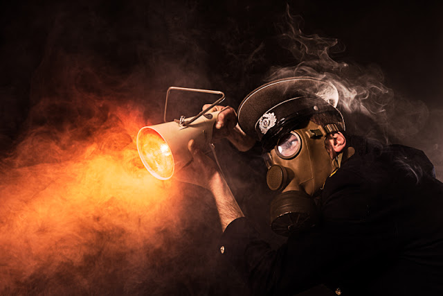


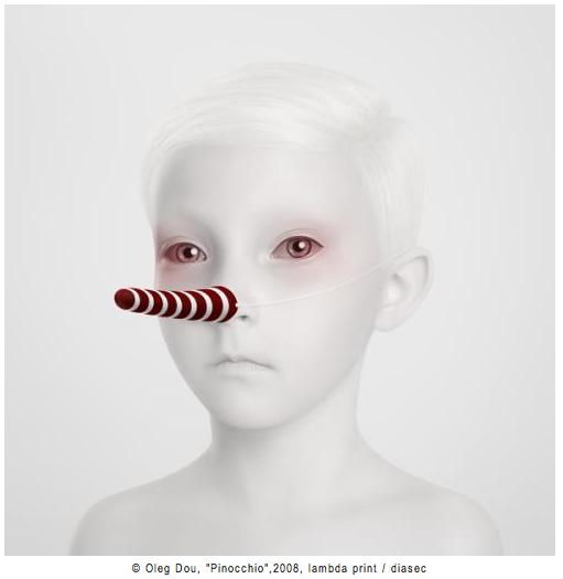


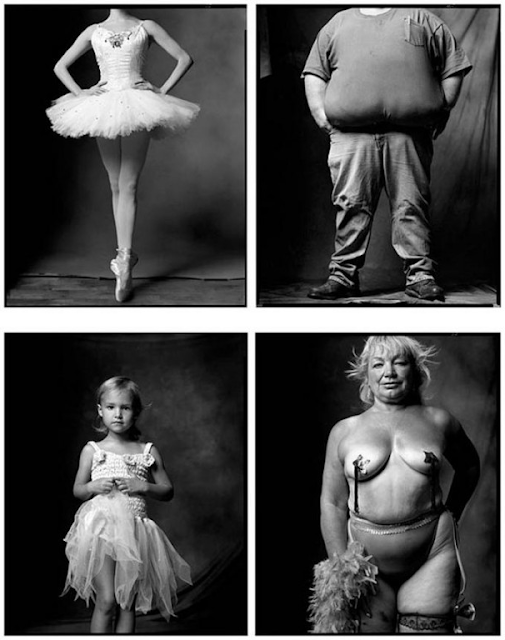


Loved this blog! helpful tips. By the way, we’re running a retouching contest that you might find really interesting!
ReplyDelete